Ok.
I’m going to just vent about this one.
I need to say, before anything else, that Jared Leto is a phenomenally talented actor, and regardless of what the character will end up looking like in the finished film, Leto will knock the actual performance out of the park. I’m not doubting his acting ability for a second, and as soon as I heard he was cast I was over the moon about it.
So, with that being said, try to keep in mind that I am in no way judging Leto or even the film itself in this article. I am purely looking at the visual design of the character in this one photo.
So, I am a huge Batman fan. I have always been a huge fan. I can literally not remember a time in my life when I didn’t love Batman. The Joker is an extension of that, but it’s more than that too, I am a huge JOKER fan. I love his character. I love his look, I love the way he talks and acts. I love how excessively, unapologetically insane he is. I love the Joker.
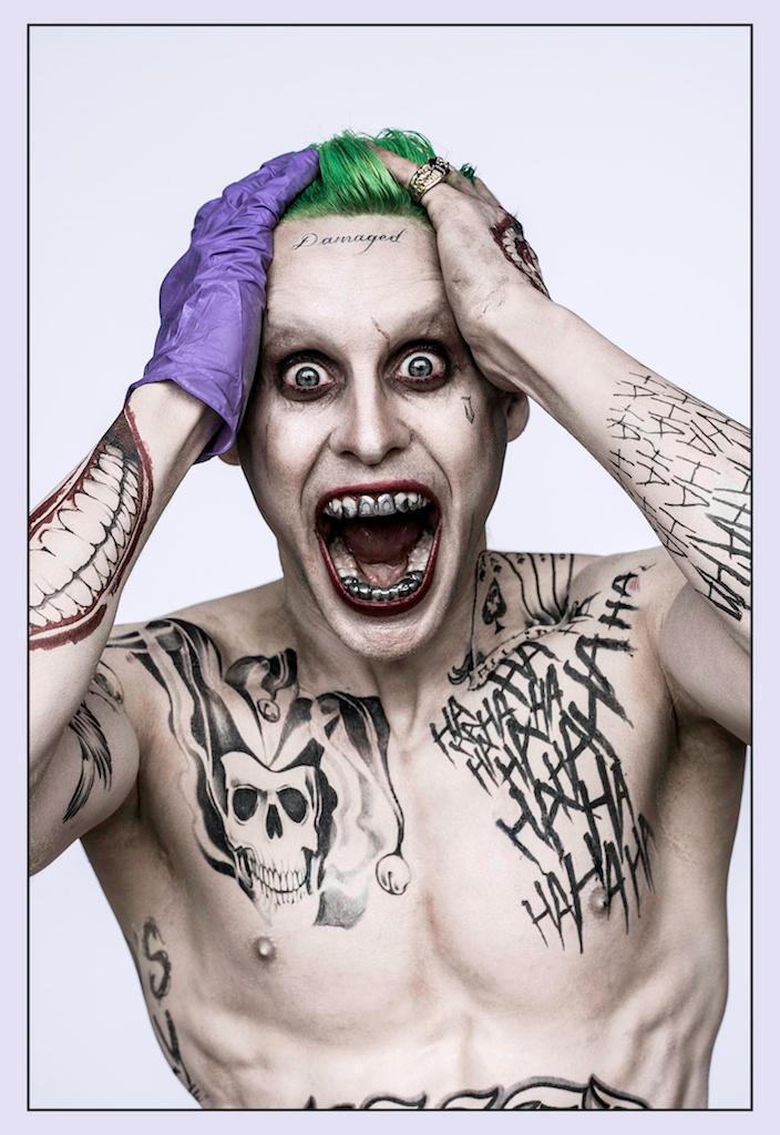
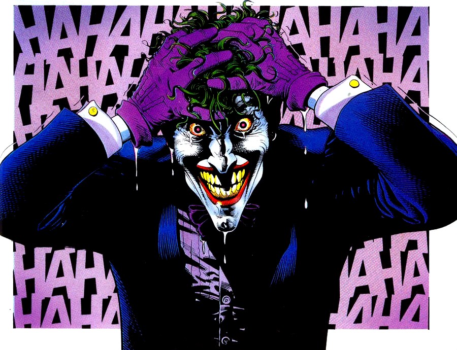
Pictured: NOT the Joker.
Now, I’m working with the assumption that this is a promo pic to drum up publicity for Suicide Squad, and to pay homage to a legendary character on his 75th anniversary. That being the case, I love this photo (except for the fucking grill), and I think it’s an awesome way to show appreciation for a 75 year old character while simultaneously grabbing the attention of fans and creating controversy. A great achievement, IF that was its purpose.
If, however, this is how the Joker will look in the film… Well, they got it wrong. Very, very wrong. And that’s what I want to rant about now. I’m going to treat the photo as if it is the version of the Joker that will appear in Suicide Squad, just for the purposes of this article.
Obviously reception has been all over the shop, with some people loving the new look and others (being correct) hating it. I think that some of the ideas presented in the photo are interesting and could lend themselves quite nicely to the character, but not exactly as they are shown. Other ideas are ridiculous and make no sense, no matter how you try to justify them. I’m going to go into detail now about how I feel about each aspect of the photo, starting with…
1): The Tattoos.
So, I think firstly that tattoos in general are not a terrible idea for this kind of character. They could work, if done very, very well. These tattoos are, however, too self-referential, too obvious, and too much. Seriously, even if the Joker was the type to get tattoos, this many is definitely out of character. Especially the fucking facial tattoos. Any person that needs to get “damaged” tattooed across their forehead does not need a label for their insanity to be obvious. Someone that fucked up will be noticed by everyone around them for what they are regardless of their choice of decorative ink. Also, the font is way too pretty and neat. The Joker has always been portrayed as almost ADHD in his inability to focus for too long, his constant changing personality, and his physical mannerisms. He moves a lot, he is jittery and cannot be contained. The idea of him sitting down long enough to get such a neat tattoo is ridiculous.
One thing I’ve heard a lot of people say about this in order to justify it is that the Joker is insane. They say that it’s “realistic” for an insane person to have “crazy” tattoos. That is the weakest justification I can possibly think of. Of course he’s insane, he’s always been insane, and he’s never had tattoos. Now, I’ll admit that at one point he did have tattoos in the comics, and that’s the second point of justification I’ve heard a lot of people hide behind. He was portrayed very briefly in ONE comic as having tattoos, and that was a non-canon appearance and was not too great to be honest. Also, the tattoo that the Joker was depicted as having in that comic was a dragon on his back. Dumb. By the way, this was the same comic wherein Batman utters the ridiculous line “What, are you dense? Are you retarded or something? Who the hell do you THINK I am? I’m the goddamn Batman.” So… Yeah, not the greatest example of a good DC comic and definitely not an accurate interpretation of any of the characters involved.
Pictured: ALSO not the Joker.
2): The “Grill”.
Fuck this. Fuck that stupid fucking “grill”. It’s so dumb. It looks so gross and fucking pathetic. I’m gonna go right ahead and have a go at the people defending it with this lousy justification:
“It makes sense because the Joker has had his teeth broken by Batman, they’ve been knocked out so many times by now that he’s just gone ahead and replaced them with metal, hurr duh durr-durr!”
I’m paraphrasing of course, but seriously? I mean, really?!
Yes, the Joker has had his teeth knocked in a fair few times in the comics, but so has EVERY FUCKING CHARACTER EVER. If it was such a huge issue, the Joker would have been drawn in the comics with a dumb gangsta-style grill too. But he wasn’t. You wanna know why? Because it looks dumb as hell. He is famous for his smile. The “Joker Grin” is an oft-used phrase throughout the comics for a reason. He uses toxic gas to kill his victims which force their still-dying bodies into forming rictus grins. His smile is what makes him the Joker. If he didn’t laugh and smile and make jokes, he would just be a random psycho. That’s what the picture of Leto looks like. Just some random wanna-be gangsta psycho Joker fan-boy.
I could accept the tattoos, I really could, if I really had to. But this fucking grill, I can’t even fathom why they chose this stupid fucking thing. Even if this is not what the character will look like in the movie (which is definitely the case, you’ll see, they’re just fucking with us), the grill makes no sense. Even just as a one-off, non-canon homage to the character, he has literally never had anything other than his trademark Joker grin to show off. This does not work and does not look good.
3): The Body.
Now, I don’t know if Jared Leto is putting on more muscle than what is shown in this picture, but I really like the body that he’s currently got. He’s slim, with a wiry sort of strength, he does have muscles but he’s not a tank of a man. That’s definitely the right direction. A bit more muscle would be fine, but I really hope he’s not gonna be crazy huge. I mean, I can’t imagine that happening, coz Jared Leto has never really been a big guy (except for Chapter 27, but that was pure fat and zero muscle, and that’s definitely not what’s happening here), but you never know I guess. It is definitely one of the more accurate bits of this photo though.
Haha, I surprised you, didn’t I? You thought this whole thing was gonna be negative! Well it mostly is, I’ll give you that, but some aspects of this photo are actually great, including…
4): The Hair.
YES. I love this hair. Leto properly dyed it, it’s a nice bright green and it’s neat and permanent-looking. That coupled with his incredibly pale skin give the impression that they’re going for the comic-accurate “bleached by chemicals” look. This is very, very good news. Don’t get me wrong, I loved Heath Ledger’s performance in The Dark Knight, but there were a lot of aspects to his version that veered wildly from the canon version of the Joker.
That’s not a problem, it’s just that I don’t see why Ledger’s version has come to be accepted as the “definitive” Joker that everyone turns to for comparison.
There are a lot of comic book versions of the Joker that employ this same hair style, and it looks great on Leto, and I’m really excited about that. Especially considering the tattoos and ridiculous metal teeth (seriously, really?!) probably won’t actually appear in the film, what’s left is a great interpretation of the Joker.
5): The Make-Up.
I actually really like the make-up too. Especially the eyes. The Ledger version had those panda bear style eyes and it looked great for his version, but the real Joker doesn’t have much (if any) make-up around his eyes. This photo shows a bit of eye make-up, but not a crazy amount, and it’s subtle enough that it accentuates his eyes without covering them in black. He also appears to have shaved his eyebrows off, which I think is a great touch. It looks creepy but in a good way, and is much better looking in live-action than green eyebrows.
The lipstick is a little dark for my taste, but that’s a pretty minor concern. At least it’s red, instead of black or some other such nonsense that it wouldn’t have been too surprising to see on this non-Joker Joker picture.
6): The Glove.
I love this, it’s a nice little nod to the classic purple suit, and it’s hopefully an indication that he will wear it at some point in the film. I know there’s been a leaked picture of the Joker in a white suit, and I do like that look in small doses, but I’m going to be really disappointed (as are a lot of fans I would assume) if his classic purple suit doesn’t make an appearance.
I guess the point I’m trying to make is that all the arguments people are making to try to justify the photo are just that: attempted justification. And if you have to try that hard to justify something, it’s usually really not the greatest idea.
Now, I’ve listed everything I don’t like and everything I do like about this version of the Joker. So, just for comparison’s sake, so you can see where I’m coming from, here are a few of my personal favourite interpretations of the Joker, in no particular order:
1): Arkham Asylum: A Serious House on Serious Earth.

Oh, sorry, I hope you weren’t planning on sleeping ever again.
Holy fuck. Look at that. If you saw that guy walking towards you in a dark alley in Gotham, you would just straight up die of fear. FUCK. THAT.
Now, I’ll concede that this version is pretty far from the norm, but what they got right, they REALLY got right, right? I mean, wow. It’s fucking terrifying. Those eyes seem perpetually wide, with pin-prick sized pupils and horrifying red gore surrounding them. The mouth is inhumanly large, the grin is massive and manic. The hair is untamed, as crazy as he is.
This is from a comic called Arkham Asylum: A Serious House on Serious Earth, obviously, and it is… An experience, to put it mildly. It is set inside the walls of Arkham and is written and drawn in a surreal, symbolic style and looks like a nightmare the reader is experiencing. The Joker is drawn perfectly in that sense; this is a surreal, horrifying version of the Joker stripped of all “real-world” influences. Even his dialogue is drawn beautifully, and perfectly suits the character. This is the first graphic novel that utilized the idea of each character having their own font, and the Joker’s is a messy, bright red scratched across the page with no borders or speech bubbles.
Definitely an amazing version of the Joker.
2): Batman R.I.P.

Again, this version is obviously a little different to the “classic” version, but there are enough similarities that it really works in this particular story. I love this version because it’s a more physical, brutal version. He looks downright deadly, and has abandoned his normally neat(ish) appearance in favour of a clown/mad scientist hybrid, looking like he spends his mornings cutting corpses apart just because. His short, slicked back hair, muscly physique, minimal make-up and general shirtlessness are a very different visual take on the character but he looks just as insane and dangerous as his usual self. I could definitely see Jared Leto’s version coming pretty close to this, obviously taking away all the aforementioned stupidity in the first official photo.
In this story, the Joker is really gunning after Batman. In the previous issues somewhere he got shot by a Batman impersonator and is mighty pissed off about it, so this is one of the few versions of the Joker where he is genuinely trying to kill Batman instead of just trying to get his attention or pissing him off for fun.
3): Hush.

In this version, the Joker looks like his classic self again. What I like about this one is the over-sized mouth. It’s one thing that I feel is too commonly overlooked in the comics and by fans in particular, and something I feel won’t ever really be portrayed properly in live action. The Joker’s mouth is one of the things that sets him apart from normal people and makes him look like something other than human. It adds a scary, unsettling aspect to his image that is unique to the Joker. It makes his grin that much more menacing.
Hush is a stunning story, with an original bad guy and beautiful artwork. The Joker has a fairly minor role but it’s still quite powerful.
4): Killing Joke.
OH YEAH. That picture right there is one of my absolute favourite comic book moments of all time. The creation of the Joker, the moment his former self is utterly broken beyond repair, and all his sanity and connection to reality shatters completely. It’s a beautiful and tragic moment, and this particular picture is perfect.
If you haven’t read the Killing Joke, read it right now. I won’t bother explaining the storyline because it is required reading for Batman fans and anyone who would bother reading this article. Seriously, read it right now.
Read it even if you HAVE read it before.
5): Arkham Origins.

So Arkham Origins got a lot of shit from a bunch of people, and I still don’t understand why. True, it was made by a different company than the one who made Arkham Asylum and Arkham City, but that doesn’t intrinsically make it bad. It’s actually amazing, and it’s my favourite Arkham game to date without question. Visually, this game is perfect. The Origins batsuit is my favourite batsuit; the Origins Deathstroke is my favourite version of Deathstroke, and the Origins Joker is definitely one of the best versions of the Joker out there.
Also, in terms of story, I found this game showed a fantastic first reveal of the Joker. I won’t spoil it for people who haven’t played it, but it’s a really great scene, and it is one of the best scenes of the Joker I’ve ever seen.
So, there you go, that’s my rant about the official 75th anniversary Joker picture and about the Joker in general.
However it ends up going, I am incredibly excited to see Suicide Squad in 2016. And like I said at the beginning of
the article, Jared Leto will be an amazing Joker regardless of what he ends up looking like in the finished film.

Pingback: Rant: The Suicide Squad Photo, And What It Means For DC Movies | So Keen For It!